interior merges with museum collection
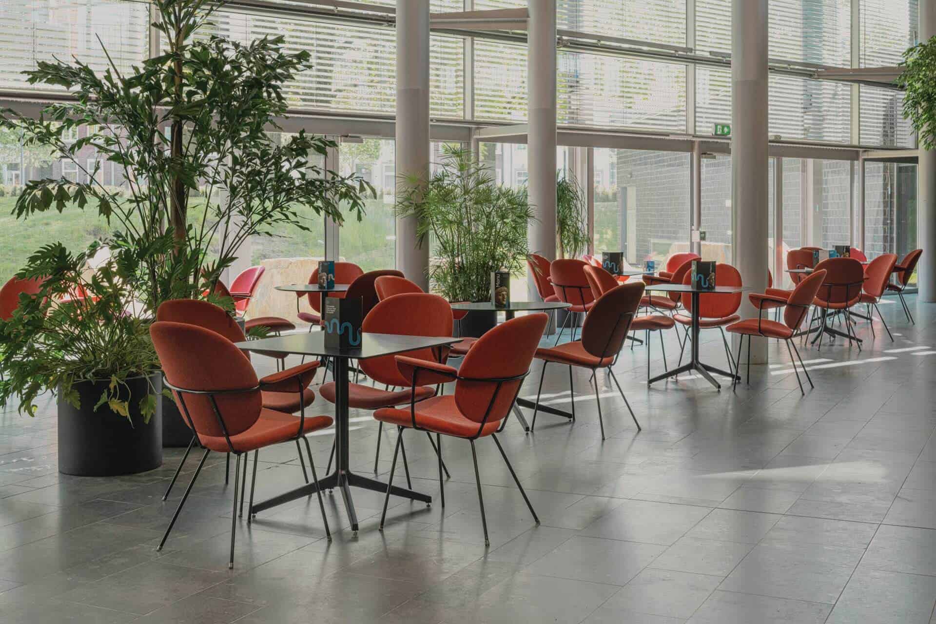
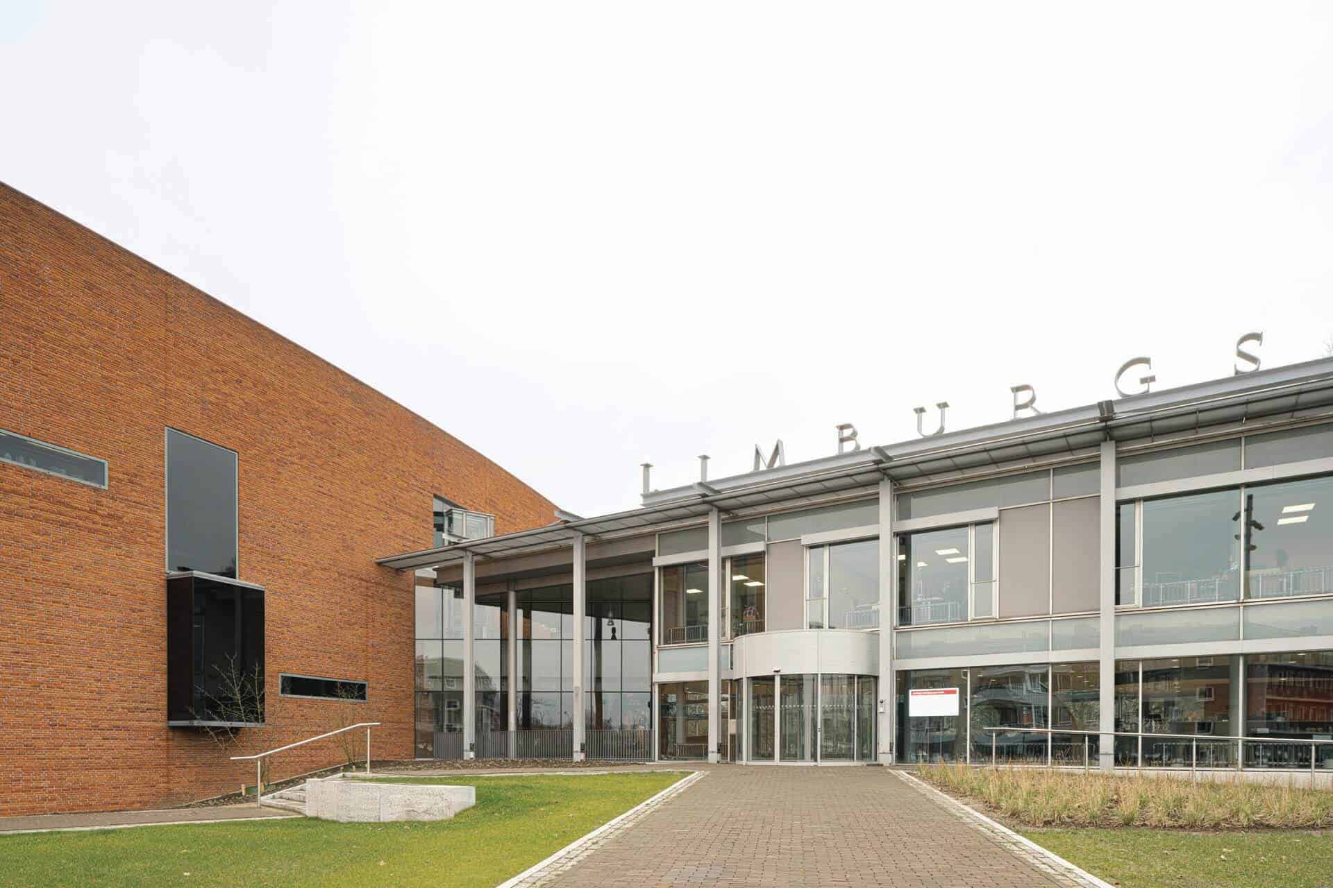
As part of the renovation plans for the Limburgs Museum, the interior is also being improved. ZOETMULDER provides a functional routing, an updated interior and improved accessibility. For example, the foyer, the museum café and the museum shop will be given a new look!
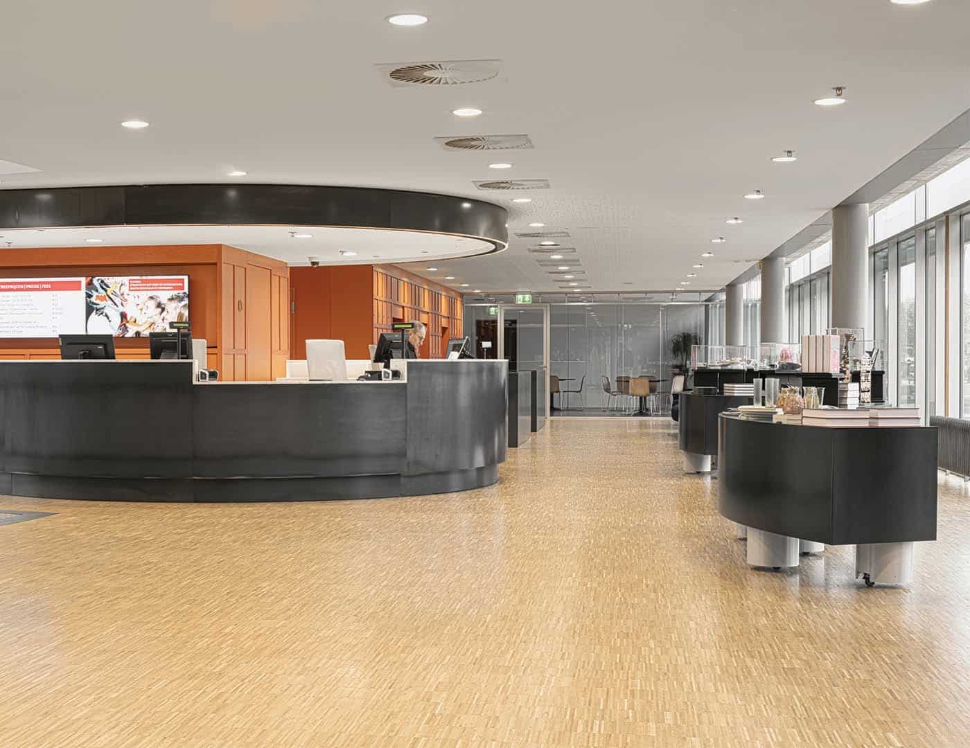
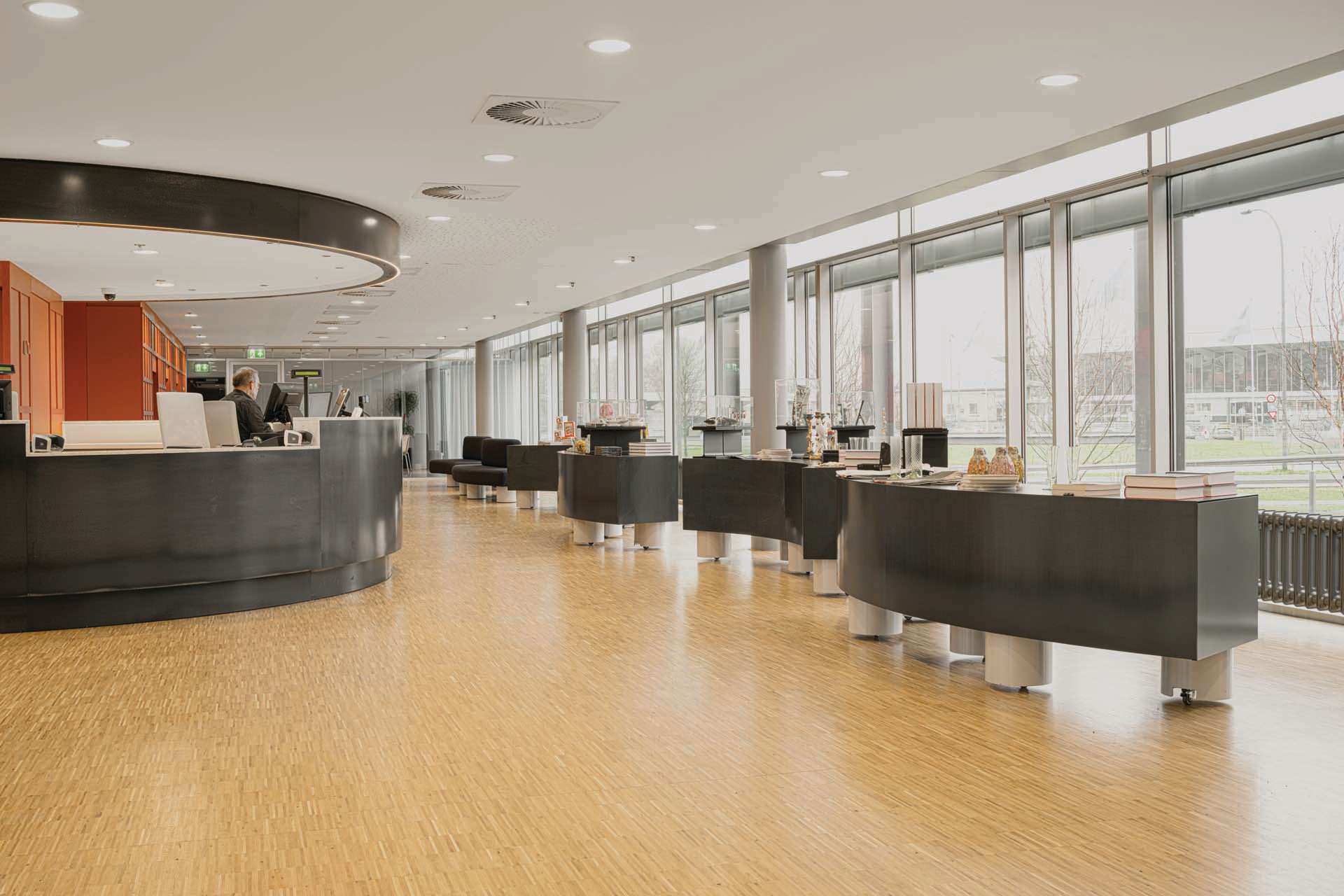
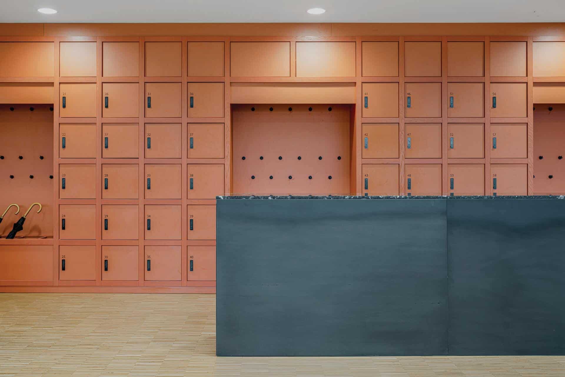
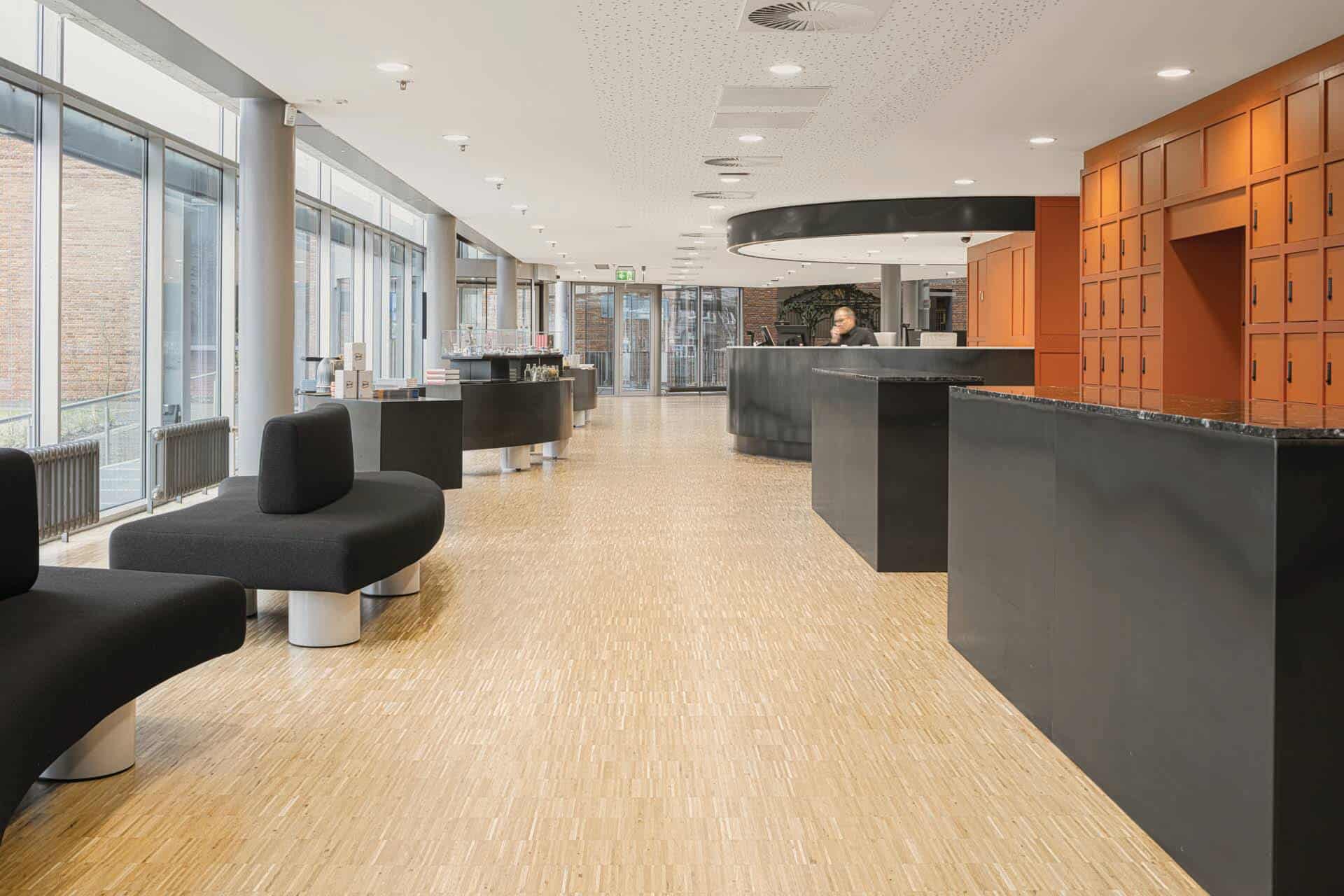
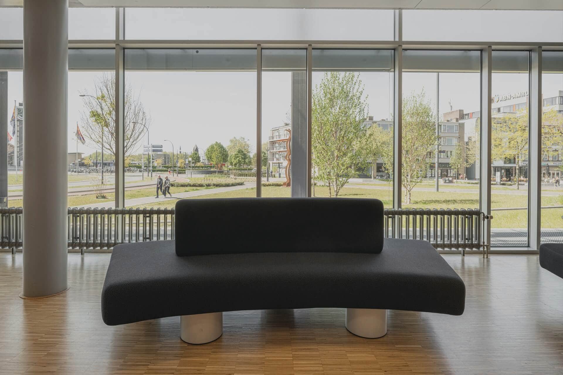
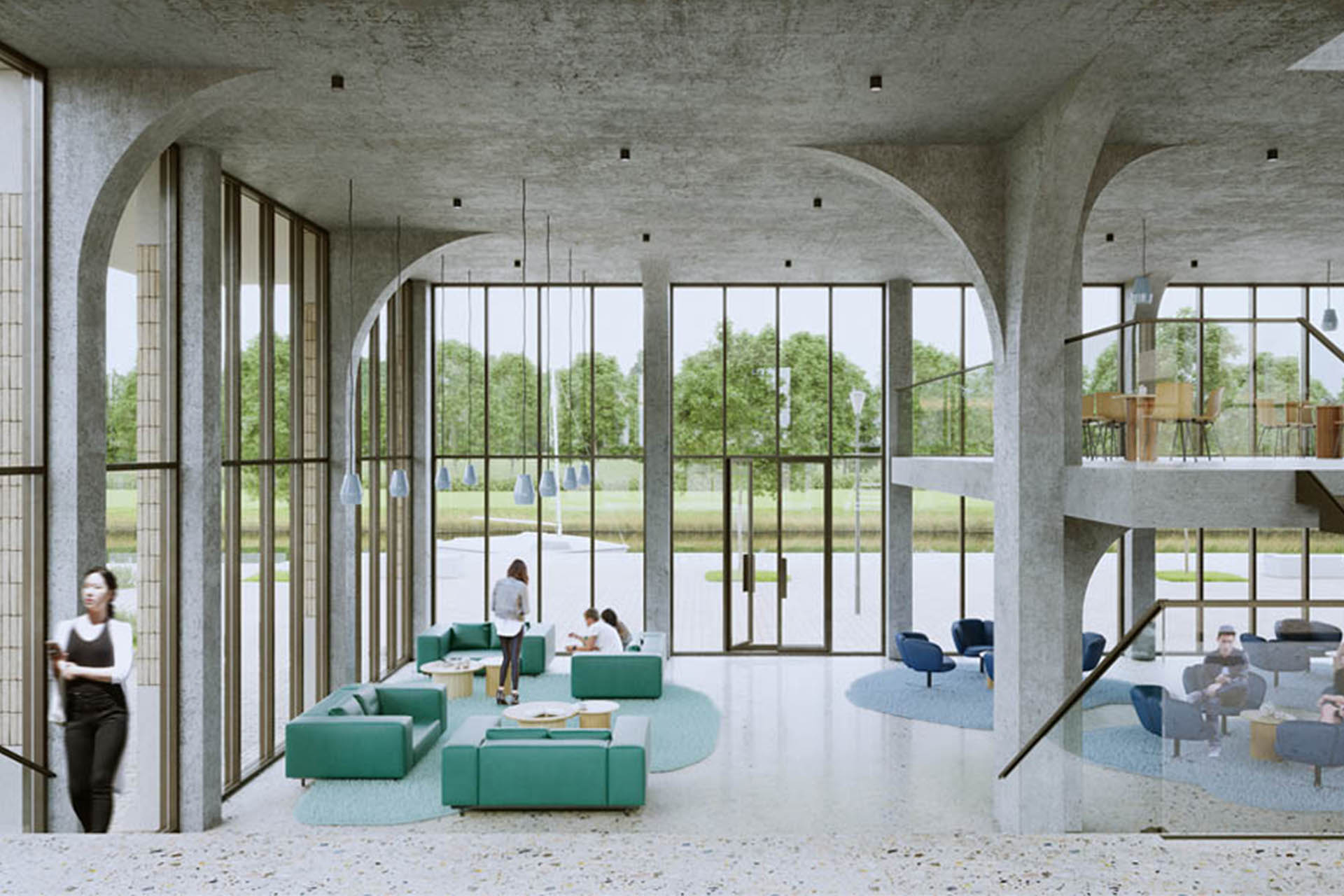
The entrance has been moved, giving the entire entrance area a new layout. All interior elements are placed in such a way that functional routing is created along the entrance desk, the lockers and the museum shop. The new layout provides a better spatial experience with clear sightlines, more light and a view of the park behind the museum. The accessibility of the museum has been increased by adding a ramp through the greenery at the entrance.
All new interior elements are designed to merge with the existing characteristic, bold identity of the building. A clear colour and material palette has been used of terracotta red, hot rolled steel and light blue. For this, inspiration was drawn from the design of the existing building and a few prominent pieces from the museum collection.
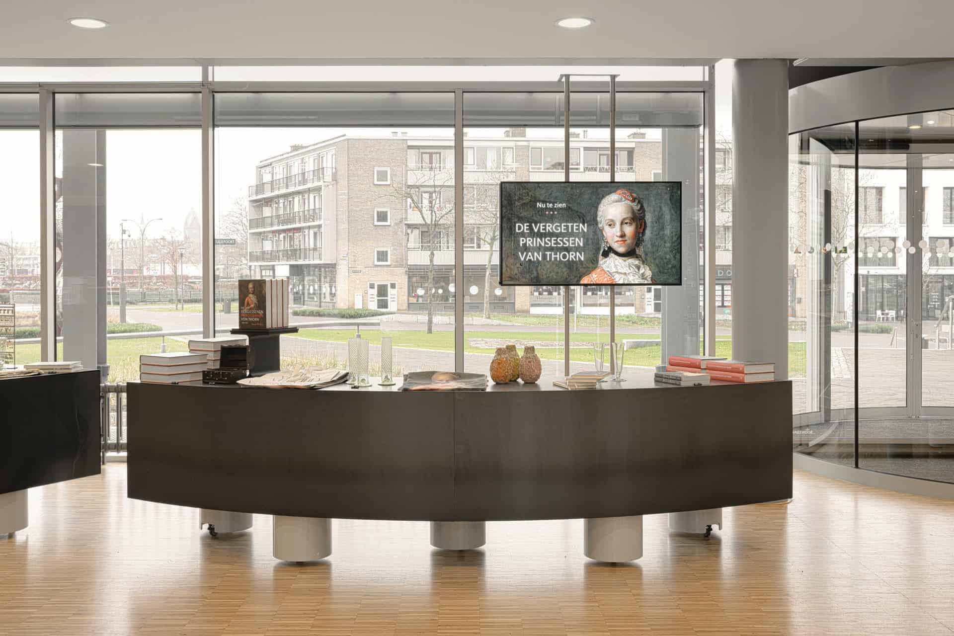
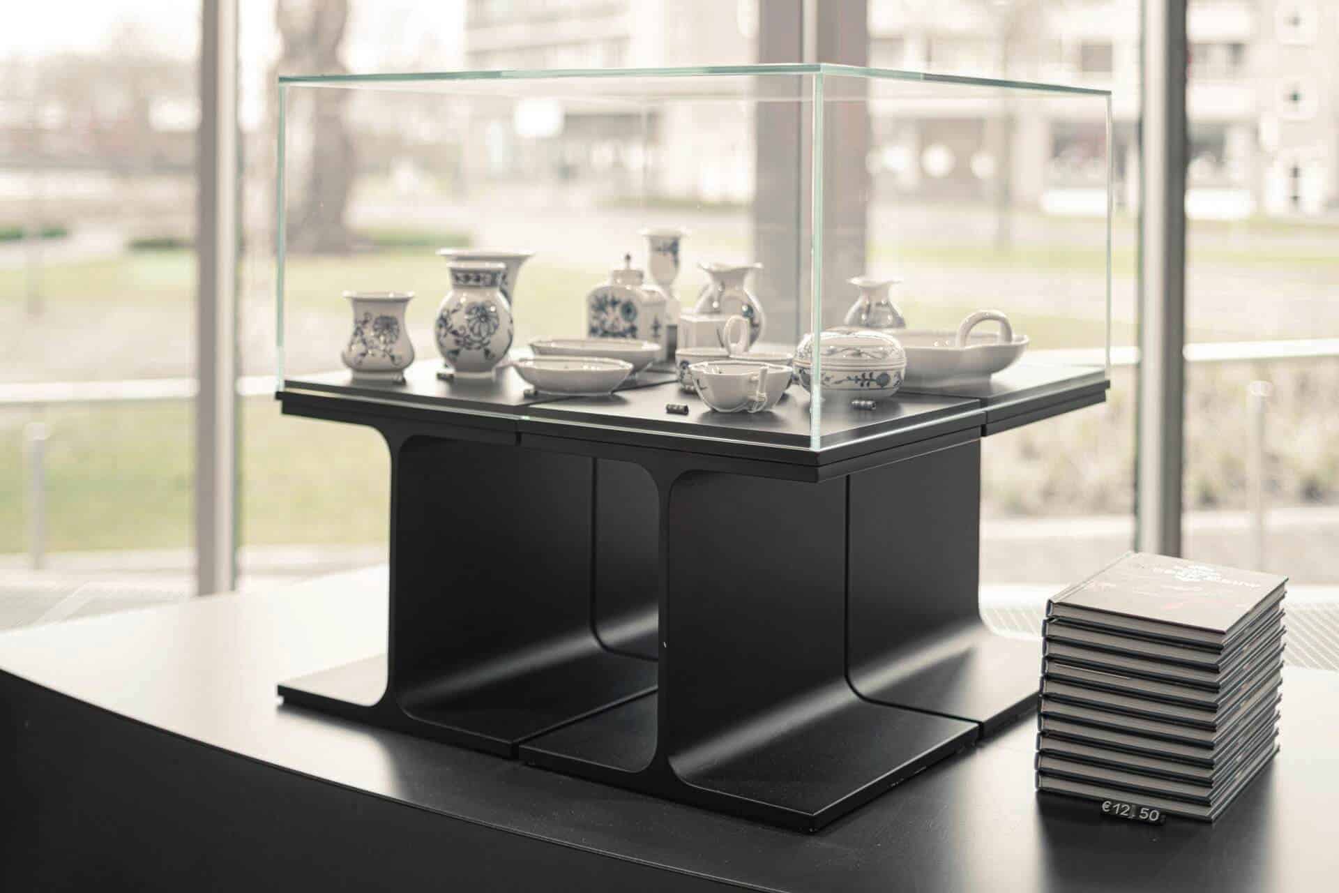
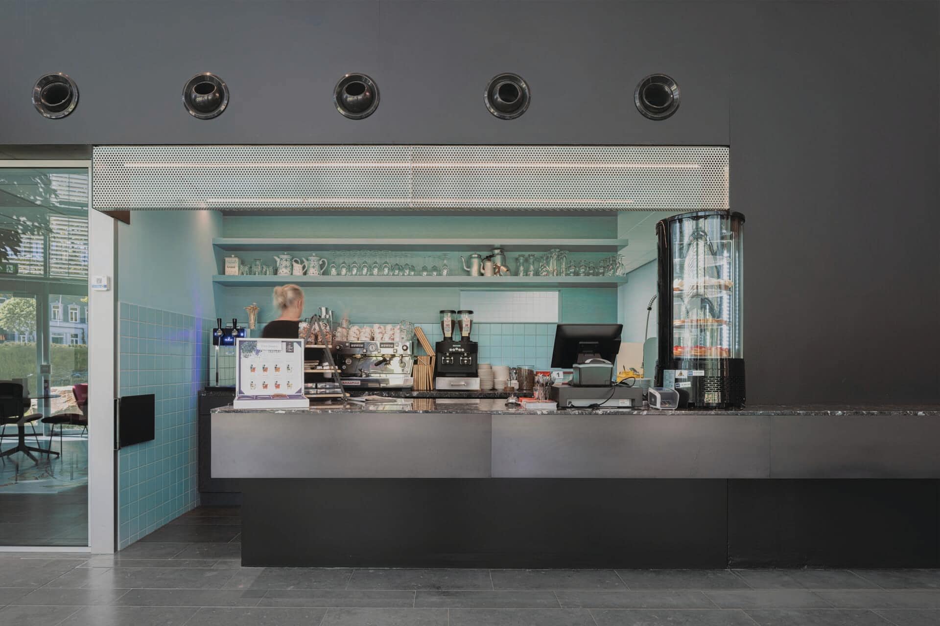
The round entrance desk is made of hot rolled steel and has a red wall behind it. This red wall continues into the wall with lockers. In the museum shop there are semicircular display furniture which fit exactly between the existing columns. The museum café in the foyer features an elongated bar made of the same hot rolled steel as the entrance desk.
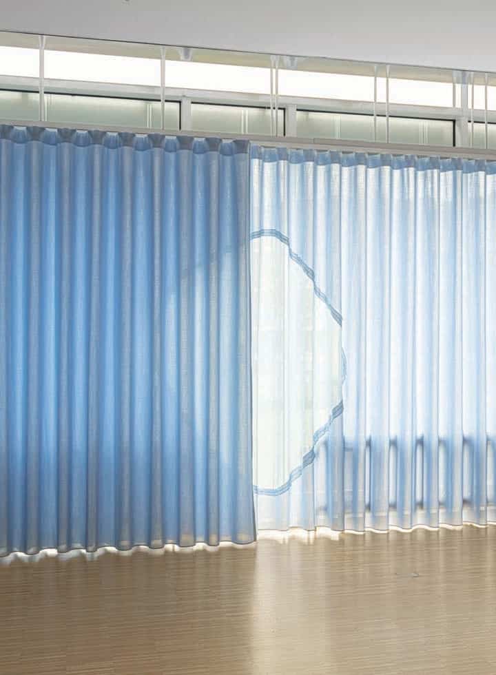
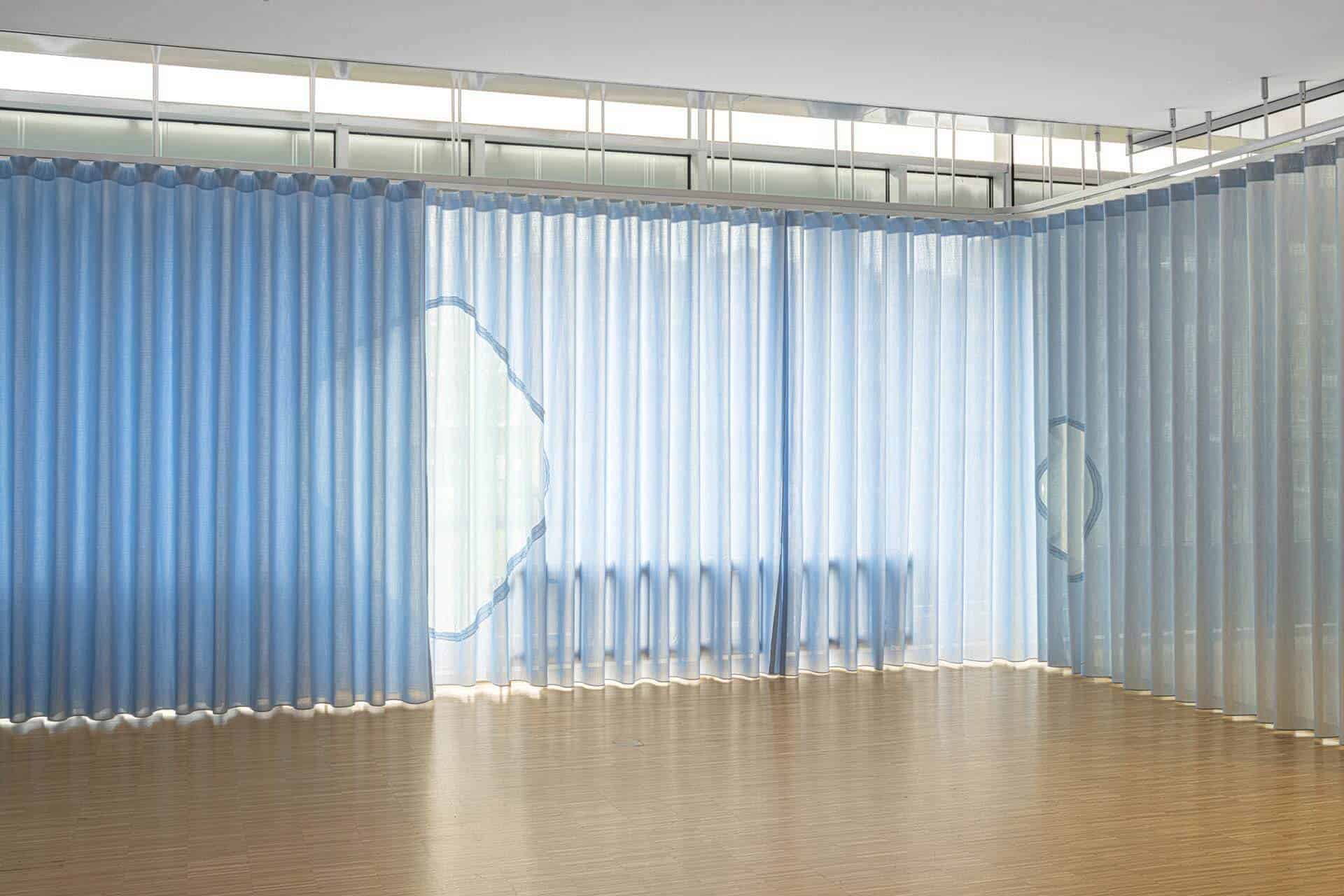
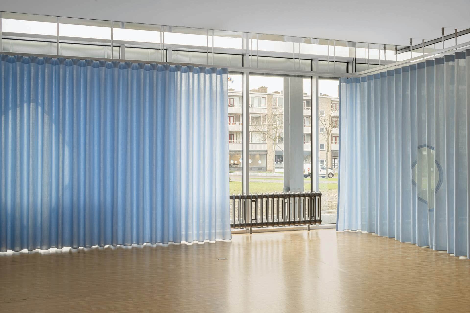
The new education room is multifunctional in use. The curtain ensures that the room can be closed off as desired. The combination of transparent and closed fabric allows the atmosphere to be adjusted in one hand movement. The built-in pantry features counter tops in two different heights, suitable for both children and adults.
This project is designed in collaboration with Jeanne Dekkers Architectuur.
Details
Client
Limburgs Museum, Provincie Limburg
